
souffle css3 弹性盒
传统的布局使用 display、float、position 有局限性,
比如“垂直水平的居中”实现起来不是贴别方便,需用定位 position 还要设置其他属性配合,所以在 2009 年 css3 中提出 flex 弹性盒的布局方案
CSS3 Flexbox 布局属性
| 属性 | ||
| flex-direction | 主轴方向 | row 水平方向从左到右(默认可以不设置) column 竖着从上到下 |
| flex-wrap | 换行 | nowrap(默认) wrap 换行 |
| flex-flow | 用于同时设置弹性容器的主轴方向(flex-direction)和换行方式(flex-wrap),默认值为 row nowrap | |
| justify-content | 主轴上的对齐方式 | center 作用多行元素或单行元素都可以 |
| align-content | 侧轴对齐方式 | center 居中对齐,只有一行项目不会生效,因为它设置的是整体 |
| align-items | 侧轴对齐方式 | center 单行居中对齐 |
当设置 flex-grow 属性的时候
1. wrap 换行失效,尽可能按 flex-basis 的值往大了去从而达到折行的目的
2. flex-shrink 也会失效,根据弹性项目(子元素)的实际宽度判断是否换行
一、弹性盒
伸缩容器和伸缩项目
伸缩容器:是设置 display: flex 的元素
伸缩项目:是容器下的子元素
1、设置弹性盒
弹性盒子是让这个容器里面的子元素(弹性项目)具有伸缩的特性,
如果所有弹性项目宽之合超出父容器的宽,项目的宽度会按照一定比例自动压缩。如果项目的高度超出了容器的高,项目的高度不会进行压缩,因为高度没有伸缩变化
<style>
  .wrapper{
    width: 500px;
    height: 500px;
    background-color: cornsilk;
    display: flex; /* 在父元素上设置弹性布局 */
  }
  .box{
    width: 200px; /* 每个子元素的宽200像素,四子元素的宽超出了容器宽度 */
    height: 100px;
    background-color: bisque;
  }
  .box:nth-child(2n){
    background-color: burlywood;
  }
  .item1{
    height: 200px;
  }
  .item2{
    background-color: saddlebrown;
  }
  .item3{
    height: 400px;
  }
  .item4{
    height: 600px;
  }
</style>

<div class="wrapper">
  <div class="box item1">item1</div>
  <div class="box item2">item2</div>
  <div class="box item3">item3</div>
  <div class="box item4">item4</div>
</div>
弹性项目默认横向排列
item1item2item3item4
2、主轴和侧轴
flex-direction 属性设置在容器上,定义主轴方向的排列方式
| 属性值 | 说明 |
| row | 水平方向从左到右(默认可以不设置) |
| row-reverse | |
| column | 竖着从上到下 |
| column-reverse |
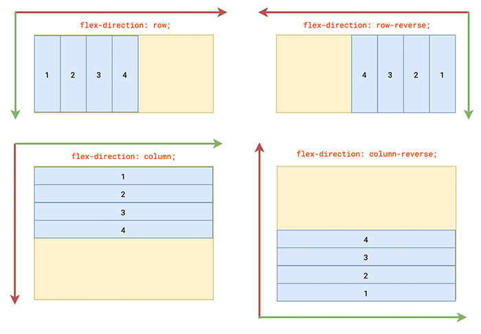
主轴,弹性项目默认在水平方向,从左到右排列,弹性项目沿着主轴进行压缩或扩展
侧轴,与主轴垂直的轴叫侧轴(也可以叫交叉轴),侧轴没有伸缩变化
二、弹性项目的伸缩变化
设置在弹性项目上的属性
| 属性 | 说明 |
| flex-grow | 放大比例,按比例分配剩余空间,也就是放大比例,默认值 0 |
| flex-shrink | 缩小比例,压缩比例,默认值 1 表示按照 1:1:1 比例伸缩变换 |
| flex-basis | 伸缩基准值 |
| flex | 复合属性由 flex-grow、flex-shrink、flex-basis 三个子属性组成 |
| order | 排列顺序,默认值是0 |
| align-self | 单个项目的对齐方式 |
flex-shrink
设置弹性项目缩小的比例
父元素的宽是 500 像素 ,所有项目之合是 900 像素
900 - 500 = 400
所有子元素的宽超出父元素 400 像素
<style>
  .wrapper{
    width: 500px;
    height: 500px;
    background-color: cornsilk;
    display: flex;
  }
  .box{
    width: 200px;
    height: 100px;
    background-color: bisque;
  }
  .box:nth-child(2n){
    background-color: burlywood;
  }
  .item1{
     width: 300px; /* 第一个子元素的宽300 */
  }
</style>
flex-shrink 的默认值是 1,
第一个子元素(第一个弹性项目)宽 300 像素,按照比例应该压缩多少?
item1item2item3item4
计算第一个弹性项目的压缩尺寸
1. 根据公式计算第一个元素要缩减的比例
公式 (flex-shrink1 * width1) / (flex-shrink1 * width1 + flex-shrink2 * width2 + flex-shrink3 * width3)
300*1 / (300*1 + 200*1 + 200*1 + 200*1) = 0.333333333333
2. 第一个元素的缩减比例乘超出的 400 像素,得到第一个子元素要压缩的尺寸 0.333333333333 * 400 = 133.33333333333331
3. 最好用第一个子元素的宽 300 减去压缩的尺寸 300 - 133.33333333333331 = 166.666666666667 就是压缩后的尺寸
如果只给第一个元素缩减
给第一个子元素设置为 flex-shrink: 1
其它子元素设置 flex-shrink: 0,但有一个问题,这些子元素的宽不缩减会超出父元素
如果主轴是垂直方向排列,压缩比例的公式就计算高度了
(flex-shrink1 * height1) / (flex-shrink1 * height1 + flex-shrink2 * height2 + flex-shrink3 * height3)
flex-grow
表示按照比例分配剩余空间,默认值是 0
如果只给第一个元素设置 flex-grow:1 表示独占所有的剩余空间
flex-basis
表示沿着主轴方向的“伸缩的基准值”,因为主轴的方向是可以变化的
1. 当主轴水平方向时,基准值相当于 width 宽度
2. 当主轴垂直方向时,基准值相当于 height 高度
3. flex-basis 的优先级高于 width/height,并按照基准值进行伸缩变化
给所有的盒子设置基准值 flex-basis: 200px,设置基准值后 width 就失效了,按照基准值的宽度压缩盒子
1. 缩减比例 (200 * 1) / (200*1 + 200*1 + 200*1 + 200*1) = 0.25
2. 超出的尺寸 (4 * 200) - 500 = 300
3. 项目要减去的尺寸 300 * 0.25 = 75
4. 最后 200 - 75 = 125
<style>
  .wrapper{
    width: 500px;
    height: 500px;
    background-color: cornsilk;
    display: flex;
  }
  .box{
    flex-basis: 200px; /*基准的宽度统一设置200*/
    height: 100px;
    background-color: bisque;
  }
  .box:nth-child(2n){
    background-color: burlywood;
  }
  .item1{
     width: 100px; /* 宽100 */
     flex-shrink: 1;
     flex-grow: 1;
  }
  .item2{
     width: 300px; /* 宽300 */
     flex-shrink: 1;
     flex-grow: 2;
  }
  .item3{
     width: 400px; /* 宽400 */
     flex-shrink: 1;
     flex-grow: 3;
  }
  .item4{
     width: 100px; /* 宽100 */
     flex-shrink: 1;
  }
</style>
每个元素压缩 75 像素
item1item2item3item4
flex 复合属性,由三个子属性复合而成
如果设置一个值代表 flex-grow
设置两个值 分别代表 flex-grow、flex-shrink
设置三个值代表 flex-grow、flex-shrink、flex-basis
order
项目的排列顺序,默认值是 0,从小到大的排列,比如 -1、0 、1
align-self
单个项目对齐的方式,沿侧轴(交叉轴)方向的对齐方式
center 居中
flex-start 测轴方向的起始位置
flex-end 测轴方向的终止位置
baseline
stretch
<style>
  .wrapper{
    width: 500px;
    height: 500px;
    background-color: cornsilk;
    display: flex;
  }
  .box{
    flex:0 1 200px;
    height: 100px;
    background-color: bisque;
  }
  .box:nth-child(2n){
    background-color: burlywood;
  }
  .item1{
    align-self: center; /*居中*/
  }
  .item2{
    align-self: flex-start; /*起始位置*/
  }
  .item3{
    align-self: flex-end; /*终止位置*/
  }
  .item4{

  }
</style>

<div class="wrapper">
  <div class="box item1">center</div>
  <div class="box item2">flex-start</div>
  <div class="box item3">flex-end</div>
  <div class="box item4"></div>
</div>
主轴是水平方向,align-self 是垂直方向的对齐
centerflex-startflex-end
因为主轴是可以变换的
如果主轴是水平排列,align-self 代表垂直方向的排列
如果主轴是垂直排列,align-self 代表水平方向的排列
三、弹性项目的对齐方式
容器超出项目的宽度,会出现空白,
当容器的宽度小于项目的宽度时,项目默认会等比例自动压缩
1、换行
容器上设置 flex-wrap 溢出换行
| 属性值 | |
| nowrap(默认) | |
| wrap | 换行 |
| wrap-reverse |
当容器的宽度小于项目的宽度时,
如果不想压缩,在容器上设置 flex-wrap: wrap 可以换行
<style>
  .wrapper{
    width: 300px;
    height: 500px;
    background-color: cornsilk;
    display: flex;
    flex-wrap:wrap; /*换行*/
  }
  .box{
    width: 100px;
    height: 100px;
    background-color: bisque;
  }
  .box:nth-child(2n){
    background-color: burlywood;
  }
</style>

<div class="wrapper">
  <div class="box item1">item1</div>
  <div class="box item2">item2</div>
  <div class="box item3">item3</div>
  <div class="box item4">item4</div>
  <div class="box item4">item5</div>
</div>
容器宽 300,项目就换行了
item1item2item3item4item5
为什么换行后,第二行的盒子在中间,不是仅挨着第一行呢?
因为换行后,弹性项目的高度不足以盛满容器,
主轴会平分容器,换成两行就有两个主轴平分容器
如果想让换行的元素合并到一起并且居中,就要用到对齐方式
2、项目在主轴方向的对齐方式
justify-content
属性设置在容器上
定义项目在主轴上的对齐方式
单行多行都可以使用
| 属性值 | 说明 |
| flex-start | 左对齐(默认),容器起始位置 |
| flex-end | 右对齐,容器结束位置 |
| center | 在主轴方向上居中 |
| 主轴方向有空白空间,可以均分空白空间 | |
| space-between | 左右两边对齐,并且项目之间的间隔相等 |
| space-around | 每个项目两侧的间隔相等,所以项目之间的间隔,比项目与边框的间隔大一倍 |
| space-evenly | 项目之间的间隔与容器与项目之间的空隙是一样的 |
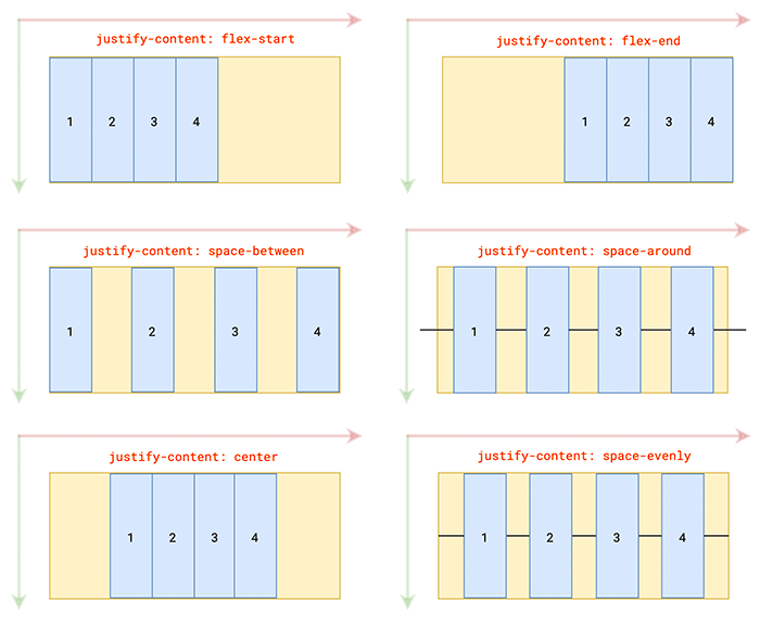
space-evenly 对齐
<style>
  .wrapper{
    width: 500px;
    height: 500px;
    border:1px solid #ccc;
    display: flex;
    justify-content: space-evenly; /* 项目之间的间隔与容器与项目之间的空隙一样 */
  }
  .box{
    height:100px;
    width: 100px;
    background-color: bisque;
  }
  .box:nth-child(2n){
    background-color: burlywood;
  }
</style>

<div class="wrapper">
  <div class="box item1">box1</div>
  <div class="box item2">box2</div>
  <div class="box item3">box3</div>
  <div class="box item4">box4</div>
</div>
项目之间的间隔与容器与项目之间的空隙一样
box1box2box3box4
如果主轴设置为 column 垂直方向,间隔就变成上下了
<style>
  .wrapper{
    width: 500px;
    height: 500px;
    border:1px solid #ccc;
    display: flex;
    flex-direction: column; /* 设置主轴为垂直方向 */
    justify-content: space-evenly;
  }
  .box{
    height:100px;
    width: 100px;
    background-color: bisque;
  }
  .box:nth-child(2n){
    background-color: burlywood;
  }
</style>

<div class="wrapper">
  <div class="box item1">box1</div>
  <div class="box item2">box2</div>
  <div class="box item3">box3</div>
  <div class="box item4">box4</div>
</div>
主轴垂直,间隔是垂直方向
box1box2box3box4
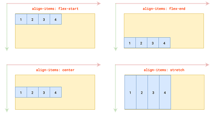
3、侧轴方向的对齐方式
上面的 align-self 属性是设置在每个项目上的,
align-items 属性是设置在容器上的沿测轴方向上的对齐方式(设置单行的对齐方式)
| 属性值 | 说明 |
| flex-start | 交叉轴的起点位置对齐,就是容器顶部 |
| flex-end | 交叉轴的终点位置对齐,就是容器底部 |
| center | 交叉轴中心对齐,容器中间 |
| baseline | 弹性项目第一行文字基线对齐,基线是小写字母 x 的底部 |
| stretch(默认) | 如果弹性项目没有设置高度或为 auto 的时候有效,项目高度将占满整个容器高度 |
baseline 表示基线对齐
意思是每个盒子的基线要在一行,
基线指的是只要有文字,基线是小写字母 x 的底部,如果项目里面没有文字,基线是盒子的底边
比如,第一个元素设置 padding 往下移动一点
<style>
  .wrapper{
    width: 500px;
    height: 500px;
    border:1px solid #ccc;
    display: flex;
    justify-content: space-between;
    align-items: baseline; /* 侧轴基线对齐 */
  }
  .box{
    height:100px;
    width: 100px;
    background-color: bisque;
  }
  .box:nth-child(2n){
    background-color: burlywood;
  }
  .item1{
    padding-top: 20px; /* 第一个元素往下移动 */
  }
</style>
</head>
<body>

<div class="wrapper">
  <div class="box item1">box1</div>
  <div class="box item2">box2</div>
  <div class="box item3">box3</div>
  <div class="box item4">box4</div>
</div>
第一个元素设置 padding 往下移动一点,其他弹性项目的都往下移动了
box1box2box3box4
ps:
line-height 属性可以影响基线的位置
第二个元素里面嵌套一个 p 元素,因为 p 元素有默认的 margin
<style>
  .wrapper{
    width: 500px;
    height: 500px;
    border:1px solid #ccc;
    display: flex;
    justify-content: space-between;
    align-items: baseline; /* 侧轴基线对齐 */
  }
  .box{
    height:100px;
    width: 100px;
    background-color: bisque;
  }
  .box:nth-child(2n){
    background-color: burlywood;
  }
  .item1{
    padding-top: 20px; /* 第一个元素往下移动 */
  }
</style>
</head>
<body>

<div class="wrapper">
  <div class="box item1">box1</div>
  <div class="box item2">
    <p>box2</p>
  </div>
  <div class="box item3">box3</div>
  <div class="box item4">box4</div>
</div>
盒子的顶部不是对齐的,但是盒子里面的文字都是对齐的,因为设置了 baseline 基线对齐
box1box2box3box4
stretch 字面是伸展/延伸的意思,这个属性值什么时候有效果呢?
1. 如果弹性项目不设置高度,侧轴的对齐方式的不是 stretch,还是 baseline 沿基线对齐
<style>
  .wrapper{
    width: 500px;
    height: 500px;
    background-color: cornsilk;
    display: flex;
    justify-content: space-between;
    align-items: baseline; /*还是沿基线对齐*/
  }
  .box{
    width: 100px;
    /* height: 100px; 不设置高度*/
    background-color: bisque;
  }
  .box:nth-child(2n){
    background-color: burlywood;
  }
</style>

<div class="wrapper">
  <div class="box item1">item1</div>
  <div class="box item2">item2</div>
  <div class="box item3">item3</div>
  <div class="box item4">item4</div>
</div>
默认高度是被内容撑开的
box1box2box3box4
2. 如果弹性项目不设置高度,侧轴设置 flex-start 顶部对齐
<style>
  .wrapper{
    width: 500px;
    height: 500px;
    background-color: cornsilk;
    display: flex;
    justify-content: space-between;
    align-items: flex-start; /*设置flex-start*/
  }
  .box{
    width: 100px;
    /*height:100px;不设置高度*/
    background-color: bisque;
  }
  .box:nth-child(2n){
    background-color: burlywood;
  }
</style>
flex-start 顶部对齐
box1box2box3box4
3. 只有在弹性项目,没有设置高度或高度为 auto 的时候,侧轴设置 stretch 伸展对齐时才有效,高度将占满整个容器高度
<style>
  .wrapper{
    width: 500px;
    height: 500px;
    border:1px solid #ccc;
    display: flex;
    justify-content: space-between;
    align-items: stretch; /* 默认的对齐方式 */
  }
  .box{
    /*height:100px;*/
    width: 100px;
    background-color: bisque;
  }
  .box:nth-child(2n){
    background-color: burlywood;
  }
</style>
</head>
<body>

<div class="wrapper">
  <div class="box">box1</div>
  <div class="box">box2</div>
  <div class="box">box3</div>
  <div class="box">box4</div>
</div>项目不设置高度,
侧轴设置 stretch 伸展,默认高度占满整个容器高度
box1box2box3box4
flex-self 和 align-item 都是设置弹性项目上的
1. 两个属性的值是一样的
2. align-item 设置在容器上,表示所有的弹性项目的对齐方式
3. flex-self 单独设置在某一个项目上的对齐
4. flex-self 的权重高于 agin-item
给第一个元素设置为 flex-self: center 侧轴居中对齐
<style>
  .wrapper{
    width: 500px;
    height: 500px;
    border:1px solid #ccc;
    display: flex;
    justify-content: space-between;
    align-items: stretch;
  }
  .box{
    /* height:100px; */
    width: 100px;
    background-color: bisque;
  }
  .box:nth-child(2n){
    background-color: burlywood;
  }
  .item1{
    align-self: center; /* 权重高于agin-item */
  }
</style>

<div class="wrapper">
  <div class="box item1">box1</div>
  <div class="box item2">box2</div>
  <div class="box item3">box3</div>
  <div class="box item4">box4</div>
</div>
flex-self 的权重高,第一个 box1 元素居中对齐
box1box2box3box4
4、多个轴线的对齐方式
align-content 属性定义了多根主轴线在测轴的对齐方式,如果项目只有一根主轴,该属性不起作用
| 属性值 | 说明 |
| flex-start | 与交叉轴起点对齐,整体在容器的顶端 |
| flex-end | 与交叉轴终点对齐,在容器的下面 |
| center | 与交叉轴中心点对齐 |
| space-between | 交叉轴两端对齐,轴与轴之间平均分布剩余空间 |
| space-around | 每根轴线两侧的间隔相等 |
| space-evenly | 平均分配剩余空间 |
| stretch(默认值) | 如果不设置高,高度占满整个交叉轴 |
容器宽度 300 像素
1. 设置 flex-wrap: wrap 表示换行,弹性项目超出容器尺寸不进行压缩
2. 换行后有两个主轴,两个主轴平分容器,第二条主轴在容器的中间,每条主轴默认都是从左到右,从上到下排列
<style>
  .wrapper{
    width: 300px;
    height: 500px;
    border:1px solid #ccc;
    display: flex;
    flex-wrap: wrap; /* 换行 */
  }
  .box{
    height:100px;
    width: 100px;
    background-color: bisque;
  }
  .box:nth-child(2n){
    background-color: burlywood;
  }
</style>
</head>
<body>

<div class="wrapper">
  <div class="box item1">box1</div>
  <div class="box item2">box2</div>
  <div class="box item3">box3</div>
  <div class="box item4">box4</div>
  <div class="box item5">box5</div>
</div>换行后两个主轴平分容器
box1box2box3box4box5
如何两行整体居中?
设置 align-content: center 后两行主轴合并在一起了并居中了
<style>
  .wrapper{
    width: 300px;
    height: 500px;
    border:1px solid #ccc;
    display: flex;
    flex-wrap: wrap;
    align-content: center; /* 多行居中对齐 */
  }
  .box{
    height:100px;
    width: 100px;
    background-color: bisque;
  }
  .box:nth-child(2n){
    background-color: burlywood;
  }
</style>

<div class="wrapper">
  <div class="box item1">box1</div>
  <div class="box item2">box2</div>
  <div class="box item3">box3</div>
  <div class="box item4">box4</div>
  <div class="box item5">box5</div>
</div>
center 两行项目整体居中显示
box1box2box3box4box5
align-content: flex-start 容器顶端
box1box2box3box4box5
align-content: flex-end
box1box2box3box4box5
align-content: space-around 空白平均分配在每个项目的两边
box1box2box3box4box5
align-content: space-evenly 空白是一样的,平均分配出三个空白区域
box1box2box3box4box5
5、align-items 和 align-content 区别
多行从中间分开,把容器分成两部分,
align-items: center 在每个行自己的区域中间垂直方向居中
box1box2box3box4box5
上面的 align-items: center 是每一行的居中
而align-content: center 是两个主轴合并在一起了,作为一个整体居中
1. 只要 align 开头的都是设置侧轴的
2. align-content 把多行看做一个整体在交叉轴对齐的方式(align-content 属性和 justity-content 属性的值是类似的)
3. align-items 每一行项目在交叉轴对齐的方式
四、响应式布局
pc端,tab在上面 content在下面
ipad端,tab在左边 content在右边
iphone端,tab隐藏出现隐藏的图标 conten依然显示
<!DOCTYPE html>
<html>
<head>
<meta charset="utf-8">
<meta name="viewport" content="width=device-width, initial-scale=1.0">
<title>响应式</title>
<style>
  body,ul,li{
    margin: 0;
    padding: 0;
  }
  html,body{
    height: 100%;
    overflow: hidden;
  }
  li{
    list-style: none;
  }
  .wrapper{
    display: flex;
    flex-wrap: wrap;
    width: 100%;
    height: 100%;
  }
  .header{
    position: relative;
    width: 100%;
    height: 30px;
    font-size: 14px;
    line-height: 30px;
    background-color: rgba(0, 0, 0, .5);
    padding: 10px;
    display: flex; /* 弹性盒子 */
    justify-content: space-between;
  }
  .header .logo{
    width: 20%;
    color: #fff;
    text-align: center;
  }
  .header .tabs{
    flex-grow: 1;
    display: flex;
  }
  .header .tabs{
    display: flex;
    transition: right .5s;
  }
  .header .tabs li{
    flex-grow: 1;
    text-align: center;
  }
  .header .tabs li.active{
    background-color: #eee;
  }
  .header .btn{
    height: 30px;
    width: 30px;
    background-color: #eee;
    display: none;
  }
  /* 监听设备在 376 - 768 之间,平板电脑 */
  @media (max-width:768px) and (min-width:376px){
    .wrapper{
      flex-direction: column;
    }
    .header{
      height: 100%;
      width: 150px;
      flex-direction: column;
      /* background-color: red; */
    }
    .header .logo{
      width: 100%;
    }
    .tabs{
      flex-direction: column;
    }
    .header .tabs li{
      height: 30px;
      line-height: 30px;
      flex-grow: 0;
    }
  }
  /* 监听设备在 375 之内 */
  @media (max-width:375px) {
    .header .tabs{
      position: absolute;
      z-index: 1;
      width: 200px;
      right: -200px;
      top: 50px;
      flex-direction: column;
    }
    .header .btn{
      display: block;
    }
  }
</style>
</head>
<body>

  <div class="wrapper">
    <div class="header">
      <!-- header下面的loge区域 -->
      <div class="logo">渡一教育</div>
      <!-- header下面的tabs区域 -->
      <ul  class="tabs">
        <li class="active">tab1</li>
        <li>tab2</li>
        <li>tab3</li>
        <li>tab4</li>
        <li>tab5</li>
      </ul>
      <span class="btn"></span>
    </div>
    <div class="content">content</div>
  </div>

</body>
</html>
<script>
  var btn = document.getElementsByClassName("btn")[0];
  var tabs = document.getElementsByClassName("tabs")[0];
  var header = document.getElementsByClassName("header")[0];
  btn.onmouseenter = function(){
    tabs.style.right = "0px";
  }
  header.onmouseleave = function(){
    console.log(tabs)
    tabs.style.right = "-200px";
  }
</script>